For this week’s assignment, I have 4 examples of signage — 2 which I think are pretty cool, very effective, and 2 which have some room to improve.
The first good one came from a flyer on the subway:
I liked this one a lot; it drew my eye because of the prominent logo (almost half the page!) and very clear title. The information was short and sweet, but conveyed all the important details: complete summary in two sentences, followed by three distinct methods of getting more info or getting in contact, then a fun, on-brand, sign-off that doubles as call-to-action and a hook. It was also placed in the perfect location for its demographic — the subway, but more than that, high up on the wall, where taller people would see it easier.
Now one of the bad ones:
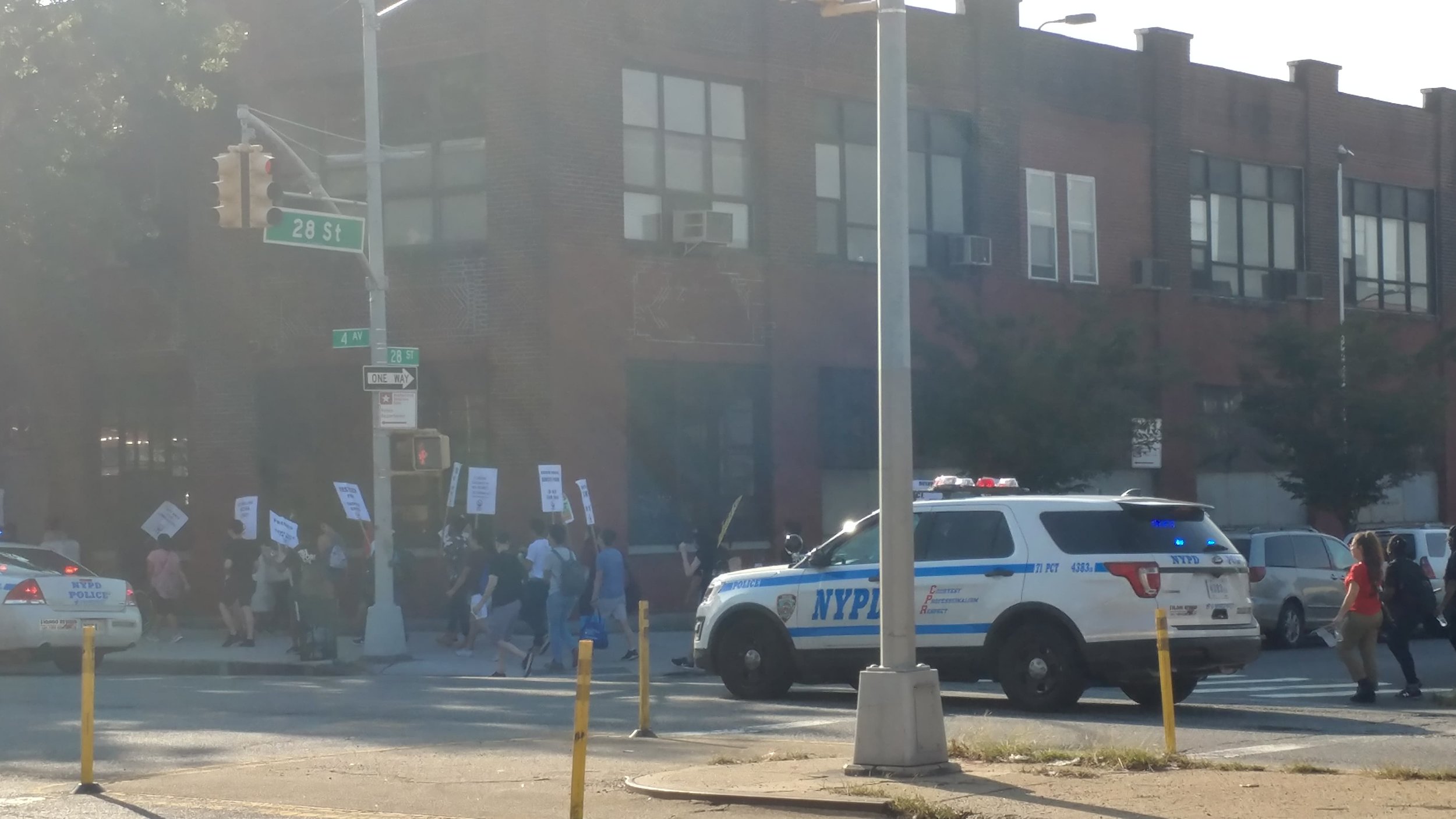
So I know the signs are hard to see from this photo, but that’s exactly my point. This was from a march near Greenwood Cemetery that appeared to be protesting gentrification and police brutality. I say appeared to be because I couldn’t read their signs very well, but I saw words like “police”, “justice”, “for sale”, “neighborhood”. The organizers had clearly gone to the trouble of mass-producing signs for the protesters, and though I think they were wise to just have black letters on a white background, the font and size of text made the content illegible for all but those in the march (though I’m guessing maybe the dozen police cars following them had a decent view too). It really made me think about how important design is in activism, because without good design, the message is totally lost. Especially in a time when social movements gain so much traction via social media, if you don’t have clear, well-designed signs, the chances of your message going viral are severely diminished.
Another simple, good design:
Nothing fancy, but it’s the kind of design that’s so good you don’t even notice it. It has very clear mailing times and instructions, and the color scheme contrasts the important info to highlight it. The best part is the “today’s pickup” indicator on the right — being able to glance at the box and know whether or not your mail will go out today or not is huge. It also lets you plan ahead if it’s a box you would use regularly. It also has the red/green psychological cue for knowing — even before you can read it — whether or not your mail is on time.
Now for the final example, a doozy of a bad one:
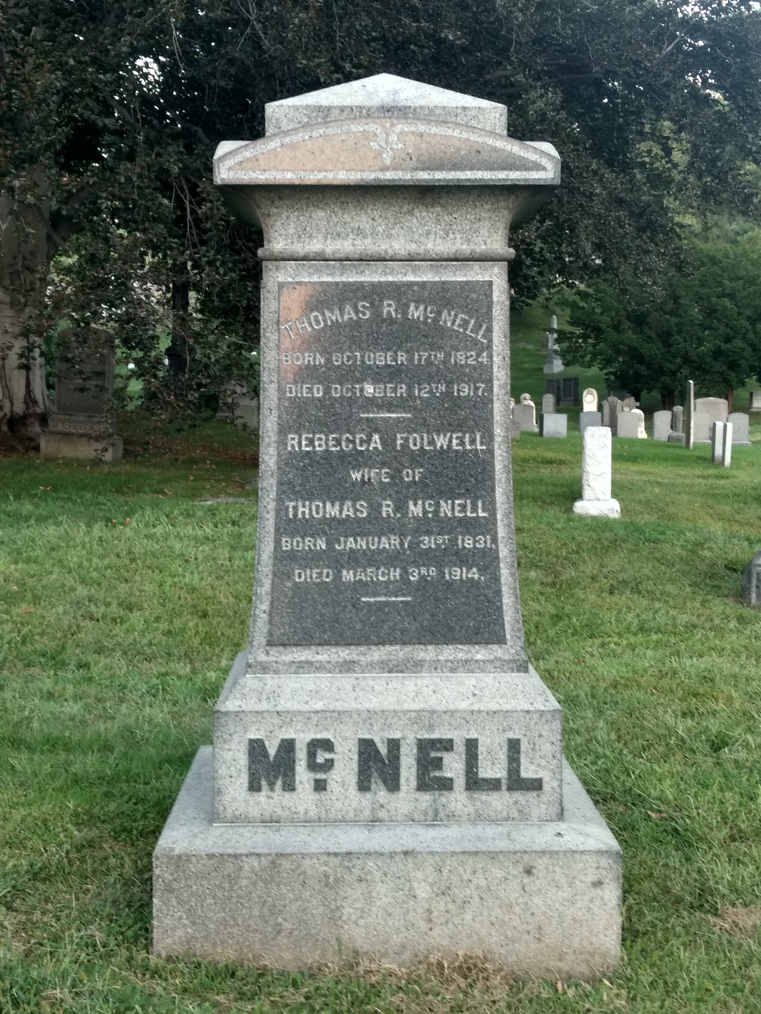
So this grave monument is a great example of why design is so important for conveying the exact message you want. Tombstones are the ultimate sign, your last chance as a mortal to tell the world exactly what you want, your last words on display for centuries. More importantly however, tombstones act as spectral billboards, letting all the other ghosts know how important you are and how many ghost dollars you have. Like the Egyptian Pharaohs, an early 20th century man would need to symbolically display his property on his burial site, or else he would not own those items in the ghost world. The problem here is you have this very important man, Thomas R. McNell, who is simultaneously trying to get across the idea that he has so many ghost dollars (the most!) while also letting all the other ghosts know that he owns a wife, Rebecca Folwell (so get your milky-white ghost-fingers off her!). He has chosen the worst way to get these two points across, though, because engravings were very expensive in the 1910’s and in choosing to have extra lines engraved (his name three times, including directly under this wife’s name) he’s revealed to all the other ghosts that he spent all his money on that. Instead, if he were a good designer, he would have realized he could have gotten across the idea that he owns his ghost-wife without having to spend all that money on extra engraving lines, simply by doing this:


