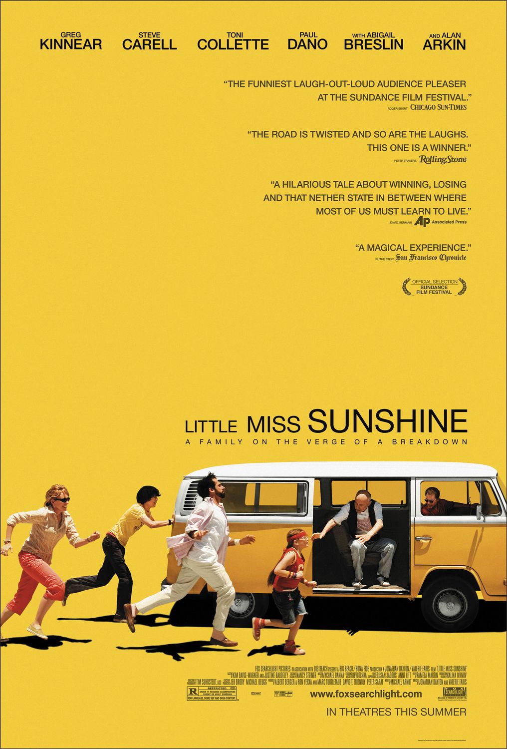
This week I chose to analyze one of my favorite movie’s posters:
Little Miss Sunshine
System and Hierarchy
I think this poster is organized very well, with the eye being drawn to the motion at the bottom. It’s an engaging image, simple, but with a lot going on and a lot of characterization. It’s clearly about a family running towards something, trying to do it together. I would argue the focus of the poster is the van, which i think is perfect hierarchy-wise, because in the film the van is the literally and figuratively the vehicle of the story, acting as the foundation and center for the events of the movie and the symbol of the hope and “mobility” of the family.
The whole poster evokes a sense of direction too, with the family and van clearly heading somewhere and even the title growing to the right, reflecting the growth of the family as they travel together.
The grid system underlying the design works well also because it splits the horizontal space evenly among the 6 actors, which reflects the movie being an ensemble without a main character. (grid image at end).
Positive/Negative Space
I really like the use of positive/negative space here. Since the movie is about a family reaching for success in various ways, I thought it was very smart to make them small and stuck on the bottom, with so much room to grow upwards. I preferred the poster before it had the blurbs/endorsements cluttering the middle/right, but perhaps that’s just life imitating art since the underdog movie achieved such wild success.
Typography
According to www.myfonts.com/WhatTheFont, the main font is Nimbus Sans.
The ultra-condensed script that displays credits for a movie is traditionally Universe 39, but I was unable to determine if this was that or a similar knock-off.
I think the simple sans-serif type was a great choice to underline the “realness” of the film. With a title like “Little Miss Sunshine”, imagine a super flowery script and how much that would have betrayed the tone of the movie.
Color Palette
Main background color: “Goldenrod” (241,203,60) // “Sandy Brown” (241, 202, 62) (not sure if there’s a slight gradient or if I’m imagining one).
Text is black, though most of my readings had the values somewhere around (14, 14, 0) — I wonder why they didn’t just use “pure” black. Paul Dano’s pants and Alan Arkin’s vest are also black, along with Paul Dano’s and Steve Carell’s hair.
The next most prominent color is the white of the van and some of the characters’ clothes.
There are slight variations to the main yellow: on the van (214, 151, 46), Toni Collete’s shoes (211, 183, 109), and on Paul Dano’s shirt (231,204,113). Half the actors have blonde or blondish hair as well.
The last set of colors are the reddish highlights, found on each character: Toni Collete’s pants (159, 43, 39), Paul Dano’s underwear (207, 135, 97), Steve Carell’s shirt (196, 158, 157), Abigail Breslin’s shirt, headband and shoes (211, 49, 36), Alan Arkin’s shirt (124, 82, 70), and Greg Kinnear’s shirt (96, 40, 23).
Interesting that there are no blues (or greens, which would obviously be the yellow plus blues), even in the black, which has the blues turned down (imperceptibly, I would argue). I wonder how symbolically tied that is to the recurring theme in the movie of trying to stave off despair.
Also interesting that since it’s a white family, their skin tones are sort of in-between the yellows and the pinkish reds.
As for the symbolism of the colors, I think yellow was a no-brainer, since “Sunshine” is literally in the title. Since it’s a movie about hope and love, it makes sense to use the bright yellow and red colors, but I like that you can sense a hint of the undertone of despair and isolation with the black and muted/brown yellow and reds.
LINK TO SLIDES:
https://docs.google.com/presentation/d/1ZEYpdbjV9umJ3Z5gFaqwsMpGISkXl2pmATYx-QZDy_8/edit?usp=sharing
PDF:
https://drive.google.com/file/d/16HfxgpXulN65_zSLknzvx5EqobrX6sgq/view?usp=sharing

