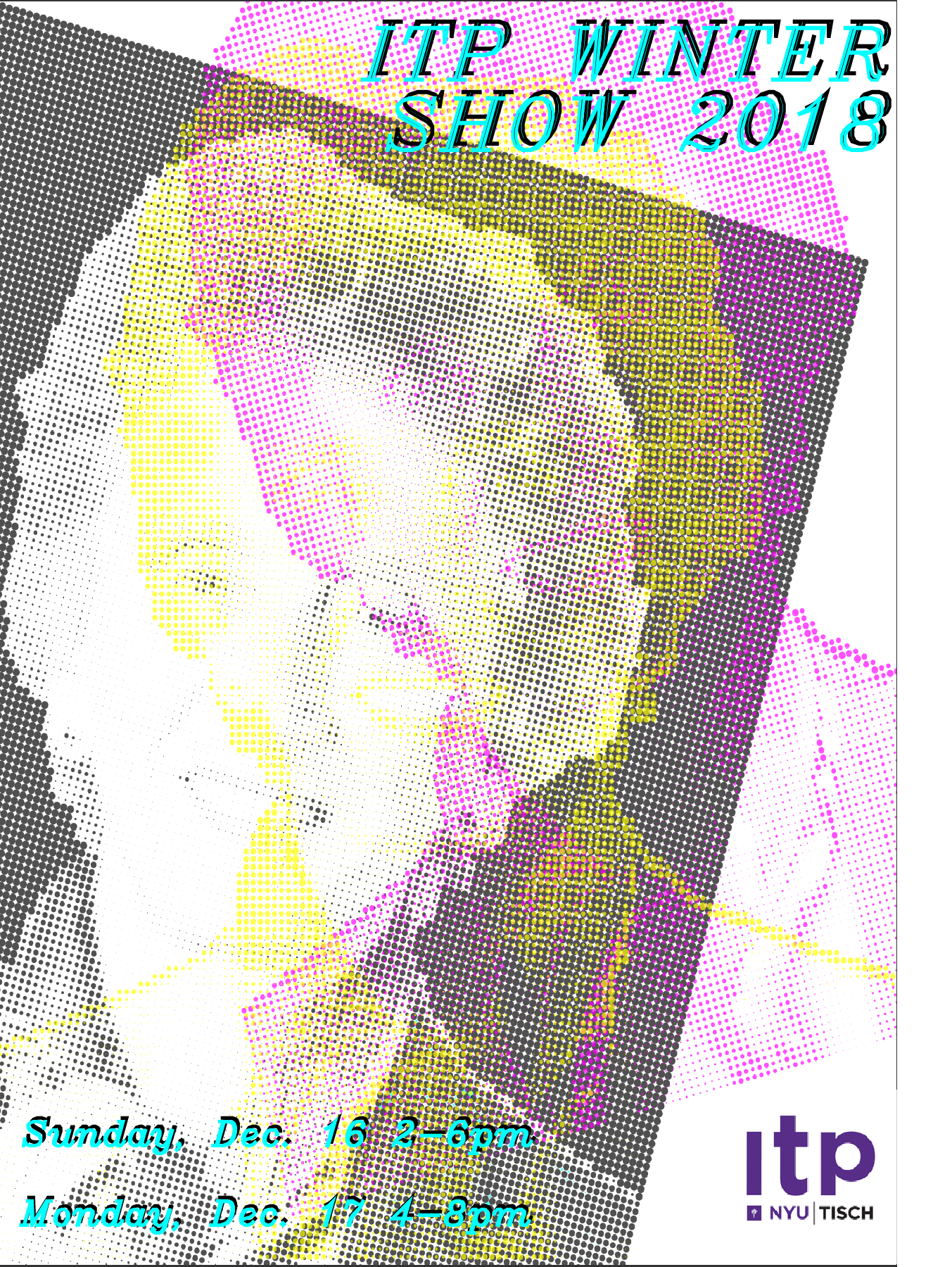
This week was super busy for me, so I didn’t have a whole lot of time to brainstorm this unfortunately — I ended up just piggybacking on a p5.js sketch I’ve been messing with for the past couple weeks, the CMYK Halftone converter.
I decided it might be cool for the flyer to be a portrait of someone in the CMYK ellipses, since the emphasis in the brief was on “a more humanistic view of ITP”, but I had no idea who to display and no time to take a really nice photo of someone. I had been thinking about Red Burns for some reason when I realized she could potentially be perfect for this. I found a nice portrait of her online, which I then took into illustrator to remove the background:
I ran that through the sketch and the first thing that came out was a total accident:
I thought, hmm, that’s cool, but not what I was planning, and proceeded to try a bunch of different variations of what I had intended:
I wasn’t happy with any of these really, and though I briefly considered combining a few of these in a pop-art/Andy Warhol style grid, decided I might as well go back with my first happy accident. I’m not super happy with how this assignment turned out, but it was a good practice exercise for me since I never ever make visual art/design like this.


