• Portfolio
  • The Ritual // BuJo
  • Workshops
  • ITP Blog
  • Idea Compost
  • Resume
  • Bio/Contact

J. August Luhrs

  • Portfolio
  • The Ritual // BuJo
  • Workshops
  • ITP Blog
  • Idea Compost
  • Resume
  • Bio/Contact

Visual Language Week 6: "Business" Cards

I’ve always had a complicated relationship with networking, and business cards have often been for me a manifestation of that fraught relationship. It was years before I decided to make some of my own, so when I was tasked with making new ones, I was less than enthused. Every design I came up with was more or less the same thing as what I had previously, since I had agonized over that original design:

The only thing I was sure I would want to change was my title, “Interaction Designer”. I still have no idea what to call myself, but I think that although I would consider “designing interactions” to be an umbrella term describing my work, I think other people’s connotations of the title make me seem like a UX/UI designer.

I still love the QR code though, which brings you here:

https://augustluhrs.art/death


So when thinking of what to do for this assignment, I had one main thing in mind: The Winter Show. It really got my gears turning in class when it was emphasized that everyone would want to have really good business cards to capitalize on the high-volume of traffic coming through for the winter show. I wanted my card to be something that was different, and since my work and myself as a human strives to focus on interactivity and creating experiences of awe, play, and connection for participants, I felt like my card should literally do that, not just represent it.

So what kind of card would not only stand out, represent me as a person, AND be interactive itself?

Enter my tried and true calling card: Diffraction Glasses.

1018181150.jpg
1018181331a.jpg
1018181332.jpg

I just love the idea of people at the winter show being able to use these glasses to add another layer to other people’s visual art pieces, especially if anyone has LED installations. I’ve just always found that giving people glasses like these instantly turns them into kids and makes them feel like they have a magic tool to unlock secret aspects of their immediate environment. The best part is, it’s a highly viral feedback loop, because if people start wearing them around or bringing them out for cool moments in the show, other people will want to know where they can get some, so people will be getting my business cards indirectly, realizing after the fact that this person has helped them have a more fun/engaging experience of the whole show, reflecting my whole shtick anyway.

So I kept the text on the glasses simple, just my email, phone number, and then square in the center (the first and last thing you see when using the glasses) is my name. The great thing about having a website that’s just your name is that you can very easily have text that does double duty, as people will just see my name, but then realize by adding “.art” to it, they can reach my website. My only concern is that it’s not super apparent that it’s a website, as it could just be a title or something, so I’m eager to hear feedback on that in class, since the website is the most important part of the info there. In fact, in future iterations, I might just have the name/website, since by going to the website, you could find my contact info.

As for the design of the text itself, since I can’t get these printed, it didn’t make sense to make a digital design. I also highly value the DIY/DIT aesthetic, so I felt like handwriting it was a nice touch. I used a sharpie, so I’m really hoping they don’t smudge after use, however, I wouldn’t mind marking my network with an Ash-Wednesday-esque holy smudge of my name on their forehead ;)

tags: Vis.Lang
categories: Vis. Lang.
Thursday 10.18.18
Posted by August Luhrs
 

Video + Sound Week 6: Mor-A-Mor Final Video

An infomercial spokesman takes us on a journey to find love in the modern world. Let love come knocking down your door, with Mor-A-Mor ;) Final Project for Matt Romein's Video and Sound Comm. Lab, ITP Fall 2018.

Alriiiiiggghhttt — it’s 3 am and I’m hopped up on dayquilllll

Had a lot of fun doing the coloring for the final cut — it’s crazy how subtle and yet massive the difference is. At first, I seriously considered not even changing the color, because when I saw the final cut I couldn’t really think of what to change — adjust the brightness on a few, sure, but nothing major. 2 hours later I had not only adjusted every clip, but I had developed a whole extra layer of the video, just with the color scheme. So cool!! Now I look back at the pre-colored video and I cannot fathom how I almost didn’t color it. Small changes make a big difference I guess.

Here’s before and afters:

The scene I’m most proud of (both color and content wise) was the trash-trip scene. We had to do it in one take ‘cause I fucked up my shoulder and foot in the first take, so thankfully it was perfect — save for the exposure. We were worried it wouldn’t be usable since it was so blown out, but I think I managed to salvage it:

The most fun aspect of the coloring, however, was realizing I could ramp up the subtle color theme we had going on to underline the narrative shift. We already had a bit of a subconscious color scheme for the infomercials with the purple-ish tones, and since we filmed the chase on a cloudy day, the light was very cool. When I filmed the last scene with David, I opted not to white-balance, because I liked how the natural warmth of the light played with the sexiness of the character. So I just ramped it up. I had every infomercial scene tinted towards pink/purple and some warmer, and every scene outside of that was super cool (-67!) with a tint of blue. I think it created a pretty cool effect, but eager to hear feedback on it. Not sure if it’s too over the top, or if people even notice. I think it’s pretty drastic at the end — maybe should’ve toned it down in the final scene. Here’s the first switch, as Rod runs off set:

Overall, I think we did a really kick ass job considering how much time we spent on this. Everyone did awesome work, Lydia’s cuts, Idit’s spot-on graphics, and David’s music… that damn song is on loop in my head, it’s so perfect.

Now to get to bed so I can wake up and make cupcakes for the last class tomorrow!!!

Still super super grateful that I got paired with these lovely humans, and super sad now that I realize this is the end of our group… Oh well, there’s always more-A-mor where that came from.

tags: Video+Sound
categories: Vis. Lang.
Tuesday 10.16.18
Posted by August Luhrs
 

Visual Language Week 5: ITP Winter Show Flyer

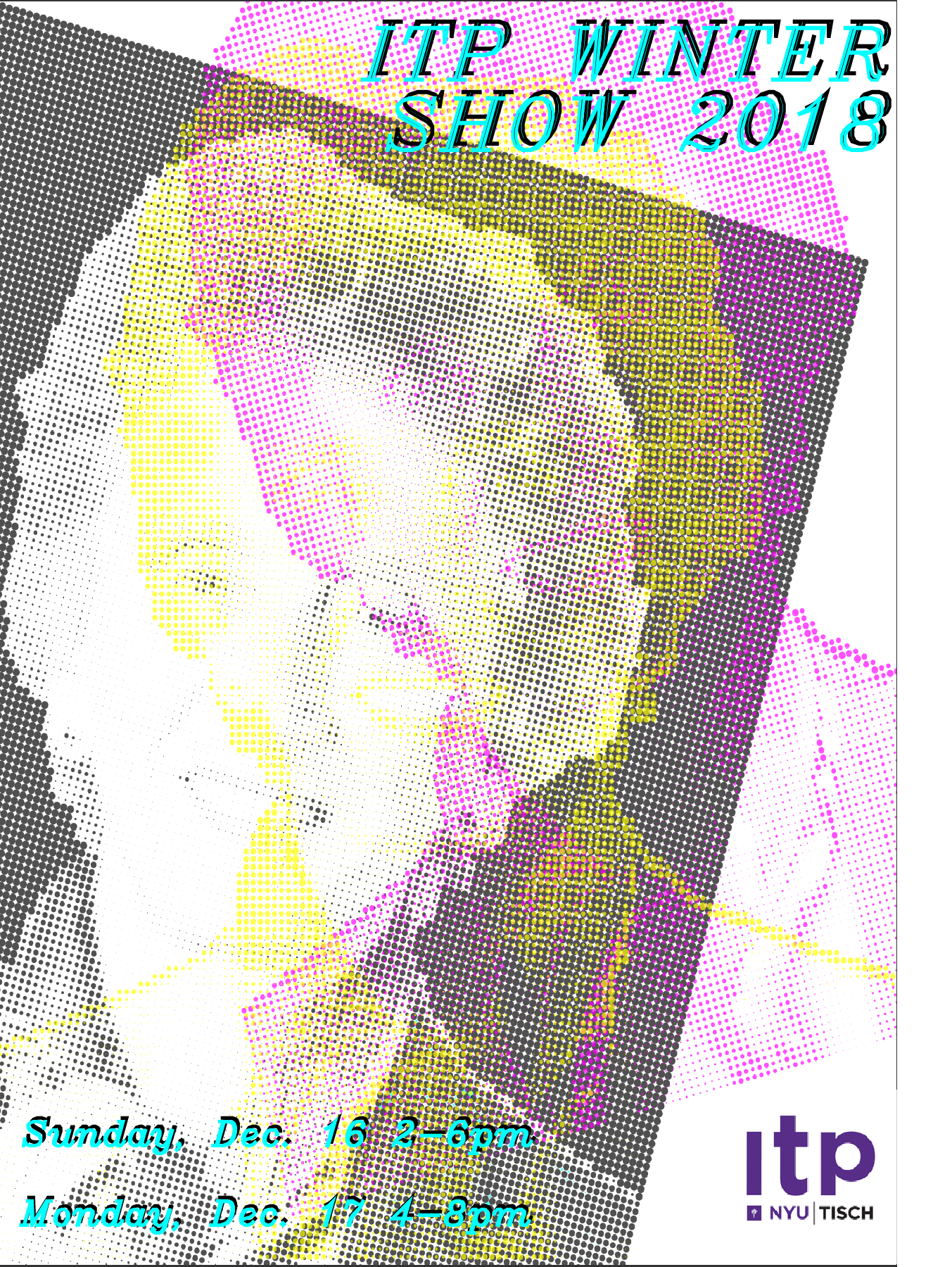
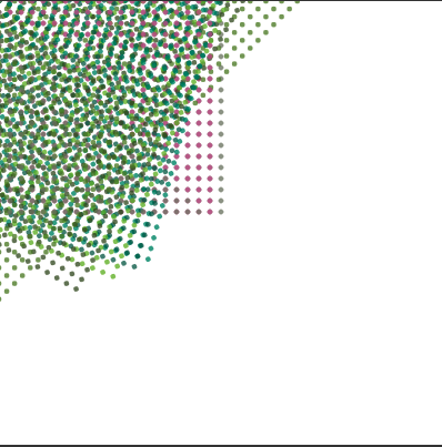
This week was super busy for me, so I didn’t have a whole lot of time to brainstorm this unfortunately — I ended up just piggybacking on a p5.js sketch I’ve been messing with for the past couple weeks, the CMYK Halftone converter.

I decided it might be cool for the flyer to be a portrait of someone in the CMYK ellipses, since the emphasis in the brief was on “a more humanistic view of ITP”, but I had no idea who to display and no time to take a really nice photo of someone. I had been thinking about Red Burns for some reason when I realized she could potentially be perfect for this. I found a nice portrait of her online, which I then took into illustrator to remove the background:

RedBurns.jpg

I ran that through the sketch and the first thing that came out was a total accident:

I thought, hmm, that’s cool, but not what I was planning, and proceeded to try a bunch of different variations of what I had intended:

BlueBurns.PNG
RedBurns_Red.PNG

I wasn’t happy with any of these really, and though I briefly considered combining a few of these in a pop-art/Andy Warhol style grid, decided I might as well go back with my first happy accident. I’m not super happy with how this assignment turned out, but it was a good practice exercise for me since I never ever make visual art/design like this.

tags: Vis.Lang
categories: Vis. Lang.
Wednesday 10.10.18
Posted by August Luhrs
 

Visual Language Week 4: Color

Screen Shot 2018-09-27 at 4.50.03 PM.png
Screen Shot 2018-09-27 at 4.48.37 PM.png
Screen Shot 2018-09-27 at 5.40.55 PM.png

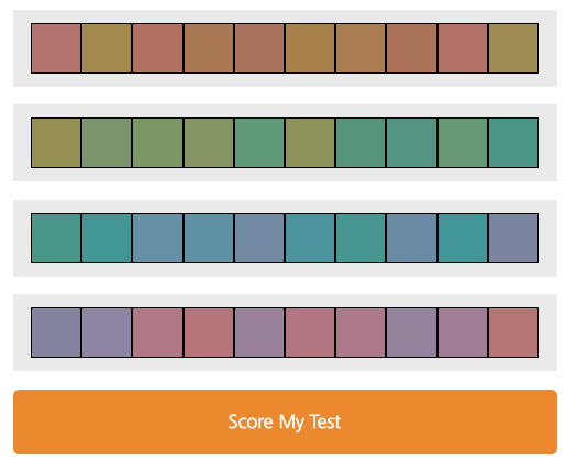
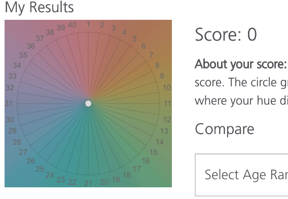
CMYK Process:

https://www.augustluhrs.art/itpfall18/cmykhell

Screen Shot 2018-10-04 at 2.07.39 PM.png

Full Screen:

https://editor.p5js.org/full/Hy4Dq0m9m

Editor:

https://editor.p5js.org/DeadAugust/sketches/Hy4Dq0m9m

tags: Vis.Lang
categories: Vis. Lang.
Thursday 09.27.18
Posted by August Luhrs
 

Visual Language Week 3: Image Words and Boarding Passes

For the boarding pass, I opted to go for very minimal information — only the stuff that the humans interacting with the pass would need:

The rider needs the flight/gate/time info displayed right at the top, and no fluff.

The security and airline staff just need name/DL/TSA precheck. The scanners can read all the other information from the barcode and other strip (no human is going, “sorry I need to check your 16 digit bag number and then your 8 digit DOCS/BCN code.”) All that stuff just clutters the ticket and makes it illegible.

I also decided to decrease the size and flip the orientation. I wanted it to be the size of a cell phone, since that would fit in most people’s pockets or phone cases, and keep all the relevant info for the rider at the top left, so if they were gripping it at the base with one hand (presumably right-dominant), they wouldn’t be obscuring any important text. I also decided to remove the perforated stub section, since I don’t think airlines have done that since digital tickets became a thing.

I don’t feel like the type is very beautiful or sized/spaced correctly, but I was more focused on the actual framework. I used Avenir because it was the first font from the handout that I saw on illustrator, but I think it fits close enough to the “DELTA” font to work.

I had a lot of fun making the image words — Illustrator makes SO MUCH more sense to me than photoshop. I really liked it. Would love to laser cut the “slug” word…

tags: Vis.Lang
categories: Vis. Lang.
Wednesday 09.26.18
Posted by August Luhrs
 

Powered by Squarespace.