• Portfolio
  • The Ritual // BuJo
  • Workshops
  • ITP Blog
  • Idea Compost
  • Resume
  • Bio/Contact

J. August Luhrs

  • Portfolio
  • The Ritual // BuJo
  • Workshops
  • ITP Blog
  • Idea Compost
  • Resume
  • Bio/Contact

ICM Week 7: Death Test -- NYT Obituary API

This week I was happy to take a slight detour away from my lovely real estate ladies to approach a related topic:

our eventual demise.

When starting the data/API assignment, I pretty much immediately knew I wanted to work with some form of mortality data, especially after reading the super inspiring article by Jer Thorp where he mentions creating a website that returns the most recent drone strike victims. I had originally planned to work with some sort of actuarial table data similar to a previous project of mine, the Death Watch, but then I was reading the NYT, and I came across the obituary section.

So now we have this, a sketch that lets you check and see if you’re dead:

obit_gif.gif

I just used the NYT API, though I found what appeared to be a super comprehensive API of all obituaries from all around the country that I really wanted to use, but it cost $750 A MONTH!!! what the hell! Can’t a gal just scan the endless horde of the dead for free?

Anyway, getting the API to work was a whole ordeal, but mainly just because the search query stuff took some getting used to. Then it was just tweaking and fine-tuning, adding features like a different response if no obituary showed up or having a different obit come up on subsequent presses.

editor

full screen

obit_test1.PNG
obit_dead.PNG
obit_test3.PNG
obit_test4.PNG
Sorry Chunhan! Hope this doesn’t come off menacing haha, was just testing names I didn’t know would come up or not.

Sorry Chunhan! Hope this doesn’t come off menacing haha, was just testing names I didn’t know would come up or not.

obit_test6.PNG
tags: ICM
categories: ICM
Monday 10.22.18
Posted by August Luhrs
 

Visual Language Week 6: "Business" Cards

I’ve always had a complicated relationship with networking, and business cards have often been for me a manifestation of that fraught relationship. It was years before I decided to make some of my own, so when I was tasked with making new ones, I was less than enthused. Every design I came up with was more or less the same thing as what I had previously, since I had agonized over that original design:

The only thing I was sure I would want to change was my title, “Interaction Designer”. I still have no idea what to call myself, but I think that although I would consider “designing interactions” to be an umbrella term describing my work, I think other people’s connotations of the title make me seem like a UX/UI designer.

I still love the QR code though, which brings you here:

https://augustluhrs.art/death


So when thinking of what to do for this assignment, I had one main thing in mind: The Winter Show. It really got my gears turning in class when it was emphasized that everyone would want to have really good business cards to capitalize on the high-volume of traffic coming through for the winter show. I wanted my card to be something that was different, and since my work and myself as a human strives to focus on interactivity and creating experiences of awe, play, and connection for participants, I felt like my card should literally do that, not just represent it.

So what kind of card would not only stand out, represent me as a person, AND be interactive itself?

Enter my tried and true calling card: Diffraction Glasses.

1018181150.jpg
1018181331a.jpg
1018181332.jpg

I just love the idea of people at the winter show being able to use these glasses to add another layer to other people’s visual art pieces, especially if anyone has LED installations. I’ve just always found that giving people glasses like these instantly turns them into kids and makes them feel like they have a magic tool to unlock secret aspects of their immediate environment. The best part is, it’s a highly viral feedback loop, because if people start wearing them around or bringing them out for cool moments in the show, other people will want to know where they can get some, so people will be getting my business cards indirectly, realizing after the fact that this person has helped them have a more fun/engaging experience of the whole show, reflecting my whole shtick anyway.

So I kept the text on the glasses simple, just my email, phone number, and then square in the center (the first and last thing you see when using the glasses) is my name. The great thing about having a website that’s just your name is that you can very easily have text that does double duty, as people will just see my name, but then realize by adding “.art” to it, they can reach my website. My only concern is that it’s not super apparent that it’s a website, as it could just be a title or something, so I’m eager to hear feedback on that in class, since the website is the most important part of the info there. In fact, in future iterations, I might just have the name/website, since by going to the website, you could find my contact info.

As for the design of the text itself, since I can’t get these printed, it didn’t make sense to make a digital design. I also highly value the DIY/DIT aesthetic, so I felt like handwriting it was a nice touch. I used a sharpie, so I’m really hoping they don’t smudge after use, however, I wouldn’t mind marking my network with an Ash-Wednesday-esque holy smudge of my name on their forehead ;)

tags: Vis.Lang
categories: Vis. Lang.
Thursday 10.18.18
Posted by August Luhrs
 

ICM Week 6: CMYK Pearly Gates

Okay, so the CMYK saga continues. Really excited about the progress this week, because I finally made some milestone achievements:

  • Got all the ladies to the party! Wooooo all fourrrr

  • All the sliders!!! We got alpha, we got dot size, we got zoom!

  • They loop! Wow! And there’s even a button to get them to stop looping!

It’s exciting because this is essentially what I wanted when I first started: A sketch that took these four portraits and got them to loop back and forth between the images, with the only thing changing being the size of the ellipses in the arrays. The other sliders were just to mess with, to hopefully find the appropriate alpha/dotsize, since that was giving me trouble.

The major issues now (if I dare to keep working on this), are legion:

  • How do I get it to run faster without sacrificing image quality?

  • How do I increase image quality without actually having a huge image that I have to scan for pixels? Or should I just use near-group pixel processing or whatever that thing is that takes an average of a pixels neighboring matrix?

  • What alpha and dot size do I use?!??!?

  • How do I zoom without getting that corner distortion? (I suspect the answer will be obvious once I take a fresh look at it, I’m currently sleep deprived and on a lot of dayquil…)

  • How do I get the screen to be the right size? I suspect this issue lies within html, which I have very little interest in, unfortunately…

Editor:

https://editor.p5js.org/DeadAugust/sketches/ryCh-OGo7

Full Screen:

https://editor.p5js.org/full/ryCh-OGo7

tags: ICM
categories: ICM
Wednesday 10.17.18
Posted by August Luhrs
 

Video + Sound Week 6: Mor-A-Mor Final Video

An infomercial spokesman takes us on a journey to find love in the modern world. Let love come knocking down your door, with Mor-A-Mor ;) Final Project for Matt Romein's Video and Sound Comm. Lab, ITP Fall 2018.

Alriiiiiggghhttt — it’s 3 am and I’m hopped up on dayquilllll

Had a lot of fun doing the coloring for the final cut — it’s crazy how subtle and yet massive the difference is. At first, I seriously considered not even changing the color, because when I saw the final cut I couldn’t really think of what to change — adjust the brightness on a few, sure, but nothing major. 2 hours later I had not only adjusted every clip, but I had developed a whole extra layer of the video, just with the color scheme. So cool!! Now I look back at the pre-colored video and I cannot fathom how I almost didn’t color it. Small changes make a big difference I guess.

Here’s before and afters:

The scene I’m most proud of (both color and content wise) was the trash-trip scene. We had to do it in one take ‘cause I fucked up my shoulder and foot in the first take, so thankfully it was perfect — save for the exposure. We were worried it wouldn’t be usable since it was so blown out, but I think I managed to salvage it:

The most fun aspect of the coloring, however, was realizing I could ramp up the subtle color theme we had going on to underline the narrative shift. We already had a bit of a subconscious color scheme for the infomercials with the purple-ish tones, and since we filmed the chase on a cloudy day, the light was very cool. When I filmed the last scene with David, I opted not to white-balance, because I liked how the natural warmth of the light played with the sexiness of the character. So I just ramped it up. I had every infomercial scene tinted towards pink/purple and some warmer, and every scene outside of that was super cool (-67!) with a tint of blue. I think it created a pretty cool effect, but eager to hear feedback on it. Not sure if it’s too over the top, or if people even notice. I think it’s pretty drastic at the end — maybe should’ve toned it down in the final scene. Here’s the first switch, as Rod runs off set:

Overall, I think we did a really kick ass job considering how much time we spent on this. Everyone did awesome work, Lydia’s cuts, Idit’s spot-on graphics, and David’s music… that damn song is on loop in my head, it’s so perfect.

Now to get to bed so I can wake up and make cupcakes for the last class tomorrow!!!

Still super super grateful that I got paired with these lovely humans, and super sad now that I realize this is the end of our group… Oh well, there’s always more-A-mor where that came from.

tags: Video+Sound
categories: Vis. Lang.
Tuesday 10.16.18
Posted by August Luhrs
 

ICM Week 5: CMYK Purgatory

This week was pretty rough so I didn’t have as much time to work on ICM as I wanted to — and I really mean that, I was super excited all week about my idea, but could only find bits and pieces of time to work on it. So unfortunately this sketch doesn’t fit the assignment yet, and the progress is pretty marginal from the last week to now. Overall though, I’m really happy with how this sketch is turning out, and I really feel like I’ve got a good grasp on the concepts now. I got the rotation issue fixed by pre-rotating the images in processing, I met with Alejandro the resident to clear up my class/object confusion, and I’m really excited to utilize the DOM stuff we’re learning about to add all the sliders to the sketch (stepSize, portraits, alpha, zoom) and a toggle button that pauses or turns on the loop. I’m also excited to test using higher quality base images, since I had originally scaled down to go easy on the rendering, as Dan Shiffman had advised.

Here’s what I have now, and though it doesn’t look all that different at first glance, I’m super proud of the small differences:


Editor:

https://editor.p5js.org/DeadAugust/sketches/HyewFYtcm

Full screen:

https://editor.p5js.org/full/HyewFYtcm

tags: ICM
categories: ICM
Wednesday 10.10.18
Posted by August Luhrs
 

Visual Language Week 5: ITP Winter Show Flyer

This week was super busy for me, so I didn’t have a whole lot of time to brainstorm this unfortunately — I ended up just piggybacking on a p5.js sketch I’ve been messing with for the past couple weeks, the CMYK Halftone converter.

I decided it might be cool for the flyer to be a portrait of someone in the CMYK ellipses, since the emphasis in the brief was on “a more humanistic view of ITP”, but I had no idea who to display and no time to take a really nice photo of someone. I had been thinking about Red Burns for some reason when I realized she could potentially be perfect for this. I found a nice portrait of her online, which I then took into illustrator to remove the background:

RedBurns.jpg

I ran that through the sketch and the first thing that came out was a total accident:

I thought, hmm, that’s cool, but not what I was planning, and proceeded to try a bunch of different variations of what I had intended:

BlueBurns.PNG
RedBurns_Red.PNG

I wasn’t happy with any of these really, and though I briefly considered combining a few of these in a pop-art/Andy Warhol style grid, decided I might as well go back with my first happy accident. I’m not super happy with how this assignment turned out, but it was a good practice exercise for me since I never ever make visual art/design like this.

tags: Vis.Lang
categories: Vis. Lang.
Wednesday 10.10.18
Posted by August Luhrs
 

Video + Sound Week 5: That's a Wrap!

5W3A7751.JPG
5W3A7726.JPG

Phew, after a couple long (but super fun) shoot days, we’re done filming! Yay!

Still feeling super lucky that I got a group where the dynamic is so light, collaborative, and supportive. Love these humans.

Filming yesterday went a lot smoother technically, but these scenes were definitely more complicated, so we had to spend a good amount of time making sure we were on the same page as far as flow/consistency/timing went. Not to mention having to run around Clinton Hill the whole time haha. I was really eager to do a scene where I would trip over a bunch of trash bags, but forget that I sprained my shoulder recently (my dive-roll shoulder!!) so I’m really glad that when David shot it we got it in one take… Or rather, that the first take worked enough, because I couldn’t do a second one, lest I suffer another shoulder injury or another cut in my foot. Note to self: look before you leap (in the trash).

Major questions/issues I’ve been thinking about:

  • I keep thinking about the timing of all this — I mean, since this is more or less a comedy, seems like our number 1 priority should be timing. Unfortunately I think that sort of had to take a back seat to just getting it done, but I’m excited to see how everyone’s scenes work together. Just worried it’s going to be obscenely long, since the scenes I edited (3 and 4) are already 3 mins total…

  • Also worried a bit about continuity, specifically with the camera as a character. We came up against this a little in the first three scenes, but especially with the chase scene it was hard to get shots that were both fun and made sense (both in the context of the narrative and just spatially in the frame).

Overall though, I think we did a really good job with the shots, and I think with feedback today (and actually editing the audio in my scenes), we’re going to end up with a great final video. Even if we don’t, I’m sure this project will still be one of the highlights of my first semester, if not my whole time at ITP.

tags: Video+Sound
categories: Video + Sound
Wednesday 10.10.18
Posted by August Luhrs
 

ICM Week 4: CMYK Hell

So I went a bit off track this week. I wasn’t really sure what to focus on for this week’s assignment, and over the weekend I was talking to a photographer friend of mine who wanted to do some video art of one of his photo series. He has an art book full of giant prints of real estate ladies he’s gotten from newspapers, flyers, and bus benches from around the country, and they’re all super zoomed in so you can see the CMYK printing dots and it’s really beautiful:

ladies #3, 1200 dpi copy 2.jpg

Basically imagine that but 2 feet wide. Anyway, so he was talking about wanting a video where the CMYK dots in one face move and morph to become another face, in an infinite loop between all the faces. He said he talked to someone who said they could do it in about six months, and then I piped up and said, “Well, I bet I could do it by Thursday?”

Oh, the hubris.

Before I could even start coding, I realized I needed to completely learn from scratch how CMYK printing even works, something I had no idea about before last week. It was cute how excited I got when I realized the colors were just all on grids set at different angles. It was fun imagining how I would code these arrays to show up at different angles (but less fun actually trying to). I figured I could just replicate the process from the slider sketch last week and just have four arrays for each image fade the values between all of them — little did I know how hard even just getting the values would be.

It’s 2 am and I’ve been working on this for way too long, so here’s the sparknotes of how the process went this week:

Step 1) Take a small part of the picture into photoshop and use the CMYK tool to grab individual images for each color. Here’s the “Y” of the mouth:

lady3.2_mY.jpg

Perhaps that might’ve worked had the image not already been printed with the CMYK dots — trying to do this was like filtering it twice. I figured I would be able to read a brightness value of each of these images and just assign them to an array of ellipses for each color, but I couldn’t find a function in p5.js that worked the way I wanted it to, since the array of each image has 4 elements per pixel (r,g,b,a). I think processing itself would be much better for this, but I wanted to stay with p5.js for the sake of the class and the ability to eventually send my friend a website link.

So then I tried learning about all the different pixel functions built into p5.js, finding a bunch of fascinating things about group pixel processing and convolutions, but eventually landing on a page that Dan Shiffman wrote about color. While reading it, I had a sudden realization that I was paying a lot of money to be able to talk to this guy in person, not on a screen, so I quickly scheduled office hours with him for later that day. It was so surreal, it was like I walked into my computer and got one-on-one help from someone who lives in YouTube.

He basically said don’t do it haha. Or rather, that what I wanted to do would be really insanely memory intensive for p5 and javascript didn’t have the best functions for the job or something like that. I don’t remember a whole lot because I was so star-struck. But he did send me a sketch for a “brightness mirror” that took video pixels and turned them into ellipses, and that was enough for me to totally start over with a better grasp on what to do.

So I took a lower-res version of the face and rewrote a sketch with Dan’s sketch in mind, but for some reason getting the pixels to match the canvas took foreverrrrrr. But I ended up with some pretty artsy looking accidents

xMouth_art.PNG

Then once I finally got it lined up, I tried making individual ellipses for each color, instead of just greyscale:

RGB.PNG

Then came the biggest brainbender of the week: Converting RGB values into CMYK values….

I like math. I do.

I couldn’t find a pre-existing processing sketch that converted RGB to CMYK, and though I could find online calculators that did so, I really wanted to figure out the math behind it so I could easily replicate it in my code…. Three full pages of equations later, I stopped and realized I was literally trying to figure out how to invent CMYK printing and decided to suck it up and just use a calculator. I ended up having to translate the calculator into p5 variables/functions and whatnot, so I did end up understanding it (more or less). Definitely would have helped to have a better grasp on how CMYK values are actually used (I didn’t know until a good while in that they were percentages and that one would pretty much always be 0….).

So after finally getting the RGB values from the pixel array and feeding them into my expertly crafted conversion loop, I triumphantly pressed play and got this horror-show:

first_CMYK.PNG

Luckily, I understood enough about the RGB CMYK difference at this point that all I had to do was change the background to white and it fixed it.

So then, with a decent image using my fresh CMYK values, I decided to start getting more into the tricky parts of the process: shifting the arrays at an angle and having them morph into the next image. I figured for both I would probably need the ellipses to be objects instead of static images like they had been, so I tried to make a class and convert all the ellipses in my pixel for loop to objects. That’s when I came across the most beautiful accident in my short career as a creative coder:

fly.gif

That is the distilled essence of a real estate lady, metamorphosed into a happy fly, dancing across the canvas. It’s like a haiku.

I almost cried I was laughing so hard. I really do think it’s beautiful.

So here’s where I gave up for this week. I don’t understand why the loop wont push the new objects into the array — it’ll only do the first loop (four ellipses, aka the fly). I had moved it up to setup because I didn’t want it creating thousands of ellipses every draw, I only wanted the original ellipses and then have them change in draw. So I tested moving it back down to draw and giving it a jitter effect just to see, and it was clearly on the verge of blowing up my computer:

So I just took out the jitter move() and let it loop in draw infinitely. Below you can see where I ended up, I have the different colors offset by an arbitrary x, y (all horizontal), and the picture gets steadily darker as the sketch goes on and keeps drawing the same image over itself.

I really want to figure this out and help my friend, so I want to keep working on it this weekend.
First I have to figure out:

  1. why why why does the loop not push the objects into the array in setup???

  2. how the hell do I get the arrays at an angle??? translate??? go back to the original idea of making the ellipse array first and then mapping the color values to them?

  3. is it even possible to move/morph that many ellipses in p5.js or will it be so slow to be practically useless?

full screen:

https://editor.p5js.org/full/rJv6hM7cX

editor:

https://editor.p5js.org/DeadAugust/sketches/rJv6hM7cX

Sketch (above)

Original (below)

lady3.2_320x420.jpg
ladyydal.png
tags: ICM
categories: ICM
Wednesday 10.03.18
Posted by August Luhrs
 

Video + Sound Week 4: Shooting!

The shoot was so much fun! I was sort of dreading it; I have a lot of bad memories of shoots in L. A. and I thought I was done with all that coming out here haha. Luckily everyone made the day super easy and painless, and though we didn’t get everything done, I think we had a really productive day and I’m exciting to see how the first edits turn out. I was also nervous to act (once again, because of my past in L.A.), but everyone was super supportive and made me feel like a total A-lister. The craft table was well stocked with bagels and schmears too, so I hope me saying my lines over and over didn’t fill the room with a toxic scallion miasma.

As always, lots of little details that were tricky to get right and get consistently right, but I feel like everyone had a good time working it all out. Hope to get some more practice behind the camera next week, since out of acting, editing, sound, production design, writing, and shooting, I’m definitely least experienced being a DP.

I’m definitely keeping the wigs.

42885679_482527362268927_6067931934682513408_n.jpg
tags: Video+Sound
categories: Video + Sound
Tuesday 10.02.18
Posted by August Luhrs
 

Visual Language Week 4: Color

Screen Shot 2018-09-27 at 4.50.03 PM.png
Screen Shot 2018-09-27 at 4.48.37 PM.png
Screen Shot 2018-09-27 at 5.40.55 PM.png

CMYK Process:

https://www.augustluhrs.art/itpfall18/cmykhell

Screen Shot 2018-10-04 at 2.07.39 PM.png

Full Screen:

https://editor.p5js.org/full/Hy4Dq0m9m

Editor:

https://editor.p5js.org/DeadAugust/sketches/Hy4Dq0m9m

tags: Vis.Lang
categories: Vis. Lang.
Thursday 09.27.18
Posted by August Luhrs
 

ICM Week 3: Algorithmic Repetition (in Pairs!)

This week was really interesting! I’ve only collaborated on code once or twice in the past, so I didn’t really know what to expect from the process. I got really lucky and paired up with a visuals-minded person, since that’s not one of my strong suits at all. So it was really cool that Raaziq could come up with the look of it while I could focus on what I wanted to — the interactivity and puzzle aspect.

When we first met up, we didn’t really know where to go — I had been toying with some webcam stuff but had no idea how to introduce a satisfying element of “algorithmic repetition”. I expressed some disinterest in some of the examples from the syllabus, where it seemed like just a bunch of repeating squares with slightly different scribbles and no interaction. I tend to want things to be able to be played with, and we weren’t sure how to apply algorithmic repetition to that process without it just ending up some sort of paint tool or generative canvas. I can’t remember how we landed on this, but we ended up getting excited by the idea of a puzzle the user would have to solve by moving different images around to “put back together” a landscape that was randomly set up. Not exactly a whole lot of algorithmic repetition, but we snuck that in later, so whatever. So Raaziq said he would draft up a landscape with some flowers, and I went to work trying to figure out sliders:

slider.gif

This was my first attempt at a slider, and I was pretty excited to get it to work. I had used the map() function in other projects, but never attached to a web page based input, so it took a little bit of brain-bending to understand exactly what I needed to do. Then when Raaziq sent over the flowers, I went to town trying to figure out how a slider could move all of those pieces simultaneously, without a shit ton of repetitive code. That’s when things got really exciting, because I finally got to learn about…. classes and objects!!! Classes and objects have always eluded me, always being able to laboriously side-step them in previous projects since I never fully understood them. So when I jumped ahead a week to watch all the coding train videos on objects and arrays, it was like the veil being lifted from my eyes (is that the right expression? or is that me getting married? or the apocalypse?). The rest of that day was a gleeful frenzy of trial and error as I converted Raaziqs petals into var petal = new Petal (). I was pleasantly surprised by how intuitively some of the stuff came to me. I feel like in the past, with big coding concepts like this, I would spend hours trying to wrap my head around something, but with this I guess I had enough of the building blocks down that I could adapt to the new system with only a few hiccups. For example, in the code when I was trying to get the sliders to move the petals, I initially thought I would be able to just use an “object variable” in place of a variable that would be updated every time the slider would move:

so instead of — rectX = mouseX;

I thought it would be something like —- petals.this.x = mouseX;

which obviously didn’t work. But then, instead of bashing my head against the keyboard for an hour, I immediately (and almost non-intellectually, like I just felt it calling to me) knew I had to instead create a .move() function in the class Petal, that would then be called in the slider function instead.

So I had a lot of fun, and by the end of the day, had this:

flowerTest1.gif

The next day when Raaziq and I met up, we felt pretty good with the simple sketch and I went over how I did the sliders and objects. We decided we could add a little more to it, so we added the cloud slider (controlling the cloud haze effect from the coding train videos), changed the image variables into ones that would scale with the window, gave labels to the sliders since we didn’t have time to make actual bugs or birds, and added a win condition that would trigger if the image was put all the way back together. Overall, had a lot of fun with this, and really excited to see where we’ll go from here.

Code:
https://editor.p5js.org/DeadAugust/sketches/BkdnXedYX

Fullscreen:

https://editor.p5js.org/full/BkdnXedYX

tags: ICM
categories: ICM
Wednesday 09.26.18
Posted by August Luhrs
 

Visual Language Week 3: Image Words and Boarding Passes

For the boarding pass, I opted to go for very minimal information — only the stuff that the humans interacting with the pass would need:

The rider needs the flight/gate/time info displayed right at the top, and no fluff.

The security and airline staff just need name/DL/TSA precheck. The scanners can read all the other information from the barcode and other strip (no human is going, “sorry I need to check your 16 digit bag number and then your 8 digit DOCS/BCN code.”) All that stuff just clutters the ticket and makes it illegible.

I also decided to decrease the size and flip the orientation. I wanted it to be the size of a cell phone, since that would fit in most people’s pockets or phone cases, and keep all the relevant info for the rider at the top left, so if they were gripping it at the base with one hand (presumably right-dominant), they wouldn’t be obscuring any important text. I also decided to remove the perforated stub section, since I don’t think airlines have done that since digital tickets became a thing.

I don’t feel like the type is very beautiful or sized/spaced correctly, but I was more focused on the actual framework. I used Avenir because it was the first font from the handout that I saw on illustrator, but I think it fits close enough to the “DELTA” font to work.

I had a lot of fun making the image words — Illustrator makes SO MUCH more sense to me than photoshop. I really liked it. Would love to laser cut the “slug” word…

tags: Vis.Lang
categories: Vis. Lang.
Wednesday 09.26.18
Posted by August Luhrs
 

Video + Sound Week 3: Storyboards!

I love mock-infomercials. Like, love more than Billy Mays is excited. Broomshakalaka and similar adult swim shorts were my life blood in Los Angeles, and my art scene there was just as obssessed with hyper-consumerism and grotesque capitalism as I was. In one of the last shows our performing arts collective, Sokamba, did, some friends and I had a piece called “Modern Circus” which was a hellish 15 minute exercise in over-stimulation. I got to be the living manifestation of infomercials, Mr. Snuggie, and I juggled knives, blended glow sticks onto the front row, and then was crucified. It was so fun. I’ll have to find a picture or video somewhere…

I’m really excited about this group project — it was super fun to brainstorm and develop the concept, and it really feels like everyone is super on board for our idea. Here’s the synopsis:

Synopsis

    An infomercial spokesman takes us on a journey to find love in the modern world. He begins by introducing us to an enchanting necklace sure to lead buyers to the person of their dreams. During the next infomercial, he presents an automated pheremone spritzer for your home, but something seems a little off about him -- his heart’s not in it, you could say. The third infomercial starts and he begins to show off a sexy wig, but he’s clearly having some sort of breakdown. The producer tries to get him to continue filming, but the spokeman’s a wreck. Finally, he rips off the mic and runs off the sound stage. The producer and camera crew scramble to follow him as he frantically searches the manic streets for something. Eventually, he finds his ex-lover and pours his heart out, confessing his love for her and pleads for her to take him back. She apologizes, and turns to her new lover — the brand’s new spokesman, touting all the previous three products and confidently addressing the camera to introduce the fourth.

I was also pleasantly surprised by my group’s dedication to using the google doc story outline I had set up. I feel like in past group projects in my life, I would spend a lot of time making an extensive google doc so all collaborators would be able to contribute in one local, comprehensive spot, but I would be the only one to use it. With this group, everyone has been commenting, adding, highlighting, inserting pictures — it’s been a type-A dream come true. Here’s the Story Overview Doc:

https://docs.google.com/document/d/12JyjhN4vUo9ulfVs3WjwmeUW_1X62oeRkCR1i-X9H9E/edit?usp=drivesdk

We’re still working on getting all the storyboard slides together, but it feels like we’re really coming along in the process. We have basically every scene fleshed out minus the dialogue and product specifics — now we just need to draw straws to see who’s going to act in it haha. I'm not sure if it’ll be useful or not, but I’m hoping to draft a screenplay for this as well. I haven’t written in screenplay format since my screenwriting program in undergrad, so I’m itching to exercise those atrophied muscles. Maybe it’ll encourage me to get back to my dusty-shelved third feature…

tags: Video+Sound
categories: Video + Sound
Tuesday 09.25.18
Posted by August Luhrs
 

ICM Week 2: Random Tests

So this week was kind of a bust; I had a grandiose idea that I was really excited about, but didn’t give myself enough time to figure out how to do it. I wanted to craft a sketch that would start as a blank canvas with a randomly generated color as the background, and then with each mouse click, a shape would appear and start moving across the screen. However, I wanted each of the shapes to be an element of another classmate’s portrait from last week, and for them to accelerate to a specific section of the canvas where they would reassemble into their original portrait. The end result hopefully being, if you clicked enough times, eventually all the portraits would be laid out next to each other. I also hoped to have the shapes accelerate on a rate based on the frameRate(), so that the longer it played the quicker they would move.

Obviously I started by trying to scale down the idea and start with just 4 (or even 1). The big hurdle that I ran into, which is a recurring problem from last week, was I didn’t know how to represent a list of “lines” (i.e. an array where each element is another shape like “ellipse(50,50,50,50);”). I played around with some array functions, but I don’t think I know enough about the parameters of arrays to make it work. I then realized I could probably do something similar with objects, but I didn’t have time to read or watch the videos on that to figure out how they work.

arrayTest.PNG


I feel like an issue I might have in this class is wanting to bite off more than I can chew, rather than keeping it simple and working on the specific concepts each week…. Anyway, so I went back to the drawing board and just did the bare minimum:

https://editor.p5js.org/DeadAugust/sketches/S1kcFNWKm

basic.PNG

One cool thing that happened though was I accidentally signed into a p5.js editor account I didn’t remember I had, from a day-long workshop I took in creative coding in L.A. last year. (Which happened to be the exact day I decided to apply to ITP, coincidentally…). And I found this cool webcam sketch, but I don’t remember who to credit for it, just the name of the workshop. So I tweaked it a little to make it fit this week’s assignment:


(screenshot is dark because I was working from bed at 2am)


https://editor.p5js.org/DeadAugust/sketches/BJLPq3eYX

Screen Shot 2018-09-20 at 2.12.09 AM.png
tags: ICM
Thursday 09.20.18
Posted by August Luhrs
 

Visual Language Week 2: Improving Signage

For this week’s assignment, I have 4 examples of signage — 2 which I think are pretty cool, very effective, and 2 which have some room to improve.

The first good one came from a flyer on the subway:

42299618_303247467169037_6809338487922229248_n.jpg

I liked this one a lot; it drew my eye because of the prominent logo (almost half the page!) and very clear title. The information was short and sweet, but conveyed all the important details: complete summary in two sentences, followed by three distinct methods of getting more info or getting in contact, then a fun, on-brand, sign-off that doubles as call-to-action and a hook. It was also placed in the perfect location for its demographic — the subway, but more than that, high up on the wall, where taller people would see it easier.

Now one of the bad ones:

42247212_2088364561478791_5203522603326636032_n.jpg

So I know the signs are hard to see from this photo, but that’s exactly my point. This was from a march near Greenwood Cemetery that appeared to be protesting gentrification and police brutality. I say appeared to be because I couldn’t read their signs very well, but I saw words like “police”, “justice”, “for sale”, “neighborhood”. The organizers had clearly gone to the trouble of mass-producing signs for the protesters, and though I think they were wise to just have black letters on a white background, the font and size of text made the content illegible for all but those in the march (though I’m guessing maybe the dozen police cars following them had a decent view too). It really made me think about how important design is in activism, because without good design, the message is totally lost. Especially in a time when social movements gain so much traction via social media, if you don’t have clear, well-designed signs, the chances of your message going viral are severely diminished.

Another simple, good design:

41804365_333767683836737_8930462259474333696_n.jpg

Nothing fancy, but it’s the kind of design that’s so good you don’t even notice it. It has very clear mailing times and instructions, and the color scheme contrasts the important info to highlight it. The best part is the “today’s pickup” indicator on the right — being able to glance at the box and know whether or not your mail will go out today or not is huge. It also lets you plan ahead if it’s a box you would use regularly. It also has the red/green psychological cue for knowing — even before you can read it — whether or not your mail is on time.

Now for the final example, a doozy of a bad one:

41944159_248966252429741_4939745601999863808_n.jpg

So this grave monument is a great example of why design is so important for conveying the exact message you want. Tombstones are the ultimate sign, your last chance as a mortal to tell the world exactly what you want, your last words on display for centuries. More importantly however, tombstones act as spectral billboards, letting all the other ghosts know how important you are and how many ghost dollars you have. Like the Egyptian Pharaohs, an early 20th century man would need to symbolically display his property on his burial site, or else he would not own those items in the ghost world. The problem here is you have this very important man, Thomas R. McNell, who is simultaneously trying to get across the idea that he has so many ghost dollars (the most!) while also letting all the other ghosts know that he owns a wife, Rebecca Folwell (so get your milky-white ghost-fingers off her!). He has chosen the worst way to get these two points across, though, because engravings were very expensive in the 1910’s and in choosing to have extra lines engraved (his name three times, including directly under this wife’s name) he’s revealed to all the other ghosts that he spent all his money on that. Instead, if he were a good designer, he would have realized he could have gotten across the idea that he owns his ghost-wife without having to spend all that money on extra engraving lines, simply by doing this:

Tombstone_fixed.png
tags: Vis.Lang
Wednesday 09.19.18
Posted by August Luhrs
 

Video + Sound Week 2: Soundwalk (and Cupcakes!)

Link to soundwalk: https://soundcloud.com/mr_pashmak/the-mission

Link to soundwalk (without a copyright soundtrack):
https://soundcloud.com/mr_pashmak/the-mission-v2

Okay so I was putting off this blog post until I had pictures of the finished cupcakes, but here we are, 3 hours before class and the second batch of cupcakes aren’t even out of the oven :0

I’ll try to summarize our project’s process as best I can with my coffee-addled brain and lemon zest coated fingers:

We went through a lot of great ideas at the beginning. In our second meeting, we came up with an idea we were all really excited for — having someone hack into the soundwalk files and instead get you to help him on a secret mission uncovering a conspiracy at Tisch, going up the stairwell to do reconnaissance, culminating in a tense high-speed chase climax down the stairs to safety. Unfortunately, after the second week’s class, we stuck around to do a test run of how long it would take to go up and down the stairs while breaking for like twenty seconds at each even floor, and it was a massive amount of time. So back to the drawing board.

We decided to simplify the concept, but keep the physical action. While testing the first idea, we all got to the 12th floor exhausted and wondering if we were recording a sound walk or an exercise routine. Then it hit us, we could do both! We could trick people into following a guy up the stairs on a secret mission (like the first idea), but really it was just a peek into his mind as he burned enough calories to eat a cupcake. When going on the Passing Strangers soundwalk myself, I remarked that sound walks would be a great way to get people to accidentally exercise, so here was that concept, taken to the next level (ba dum skish). The cupcakes were a joke at first, thrown into the script last minute, but then I realized we might want to reward participants after making them do a workout, or else they would destroy us in critique haha.

I ended up doing the narration, and after reworking the basic script Emily and I came up with as a group to better match my natural speech patterns, I headed home to record in the solitude of my apartment. We had originally not recorded in the stairwell (the scene of the crime) because we often couldn’t get a full take without someone opening a door somewhere or stomping past us. It might have been cool to have as background noise, but after we discussed in class recording a sound by not recording the exact sound, we figured I could record at home and then we could add in the background sound later. Only problem was, I forgot that my ground-floor apartment is on the same block as a subway line, and our window looks out onto Metropolitan Ave, a super busy street with huge trucks blaring by at all hours… So I had to improvise:

42173506_1847674195326515_4670119323367374848_n.jpg

Welcome to my luxurious sound booth. I had to turn off the A/C, squeeze in between all my coats, and hyperventilate for 40 minutes. It was fun.

Getting the right levels of the mic and placement of the mic for recording something with heavy breathing was tricky. In the end I think Qice just saved me in the edits, since I don’t think I ever fully got it to the best recording settings. I also realized halfway through recording that our script was waaaay too long. Qice also swooped in to save the day there, and he Frankenstein-ed my recordings into something usable. Oh and I had the broken Zoom Lillian mentioned in class, so I couldn’t even hear myself speak, had to download the audio every-time I wanted to test levels. Should have led with that, easy target for blame.

After the rough draft was finished, we all met up to test it out, and our main discussion point was “are we giving them enough information to follow this guy?”. It was a really tricky balancing act, because we needed to be clear with our instructions, or else no one would know what to do, but we A) didn’t want to make it seem forced, since you were supposed to be listening in on a guy’s thoughts, and B) didn’t want to give too much away, since we wanted it to be a surprise that you were supposed to walk all the way to the 12th floor. In the end we added a little sentence at the beginning, and decided we would hear in feedback whether or not it was enough. In retrospect, I wish we had gotten people to playtest it blind — not sure why we forgot to do that. I think we were treating this very much as a workshop piece, in no way a final, polished product haha.

And back to the cupcakes. T-minus two hours until class. The second batch is out of the oven, and now I’m just waiting for them to cool so I can frost them. I’ve got two kinds (hopefully) to bring to class and leave as treats at the top of the stairwell:

A lemon yellowcake cupcake with matcha frosting

An espresso chocolate cupcake with mexican-chocolate frosting

Both Vegan!

We’ll see how it turns out. This is my first time baking in my new apartment, and it was tough starting over in a new spot. As I started this morning, I realized my roommates and I didn’t even have measuring spoons, so I had to eyeball the chocolate recipe while my lovely partner went out to grab me some. Fingers crossed.

42145018_771902559867868_8531775615211143168_n.jpg

Presentation Outline and Questions for Feedback:

Sound walk Presentation - Outline

  1. Introductions and Roles:

    1. August - narration, script writing, cupcake making!,

    2. Qice - compiling sounds on audition; creation of main 1st draft

    3. Emily - helping with script + editing audio

  2. Concept

    1. Original Idea -- secret mission and a chase

      1. But then we actually timed how long it took to walk the stairs

    2. Core ideas

      1. Changed around a bit

      2. All in the stairwells

      3. Twist at end

      4. Narrator’s mind vs Narrator’s directions

      5. Soundwalk as tricking people into exercising

      6. Arc

        1. Physical map matching arc? Or inverse? Lower and lower emotionally until top plateau

  3. Making Of

    1. Walking the stairs a lot

    2. Brainstorming the story/script

    3. Recording

      1. Narration

        1. August’s room debacle w/ the closet and broken zoom

        2. Obvs couldn’t record reliably in the stairwell, but maybe should have tried? Currently sounds more like we can hear his thoughts, which is probably better.

      2. Other Sounds

    4. Editing

      1. Script too long

      2. Counting the steps in each section

      3. Shining music

    5. Hard to know how to break up the labor


  1. Questions

    1. Were you keeping up with the narrator and how did that make you feel?

    2. Did you make it to the top before/after/same time as narrator and how did that affect your emotional experience of the ending?

    3. Did you have enough information to go on or were you confused? Did the mystery of what the narrator was doing intrigue you and make you want to find out or was it too vague to even follow?

    4. How are your legs? Are you glad you’ll be sore tomorrow or do you hate us?

    5. Did you want to eat a cupcake or were you afraid you’d throw it up?

tags: Video+Sound
Wednesday 09.19.18
Posted by August Luhrs
 

Visual Language Week 1: "Little Miss Sunshine" Poster Design Analysis

This week I chose to analyze one of my favorite movie’s posters:

Little Miss Sunshine

little_miss_sunshine_xlg.jpg
  • System and Hierarchy

    • I think this poster is organized very well, with the eye being drawn to the motion at the bottom. It’s an engaging image, simple, but with a lot going on and a lot of characterization. It’s clearly about a family running towards something, trying to do it together. I would argue the focus of the poster is the van, which i think is perfect hierarchy-wise, because in the film the van is the literally and figuratively the vehicle of the story, acting as the foundation and center for the events of the movie and the symbol of the hope and “mobility” of the family.

    • The whole poster evokes a sense of direction too, with the family and van clearly heading somewhere and even the title growing to the right, reflecting the growth of the family as they travel together.

    • The grid system underlying the design works well also because it splits the horizontal space evenly among the 6 actors, which reflects the movie being an ensemble without a main character. (grid image at end).

  • Positive/Negative Space

    • I really like the use of positive/negative space here. Since the movie is about a family reaching for success in various ways, I thought it was very smart to make them small and stuck on the bottom, with so much room to grow upwards. I preferred the poster before it had the blurbs/endorsements cluttering the middle/right, but perhaps that’s just life imitating art since the underdog movie achieved such wild success.

  • Typography

    • According to www.myfonts.com/WhatTheFont, the main font is Nimbus Sans.

    • The ultra-condensed script that displays credits for a movie is traditionally Universe 39, but I was unable to determine if this was that or a similar knock-off.

    • I think the simple sans-serif type was a great choice to underline the “realness” of the film. With a title like “Little Miss Sunshine”, imagine a super flowery script and how much that would have betrayed the tone of the movie.

  • Color Palette

    • Main background color: “Goldenrod” (241,203,60) // “Sandy Brown” (241, 202, 62) (not sure if there’s a slight gradient or if I’m imagining one).

    • Text is black, though most of my readings had the values somewhere around (14, 14, 0) — I wonder why they didn’t just use “pure” black. Paul Dano’s pants and Alan Arkin’s vest are also black, along with Paul Dano’s and Steve Carell’s hair.

    • The next most prominent color is the white of the van and some of the characters’ clothes.

    • There are slight variations to the main yellow: on the van (214, 151, 46), Toni Collete’s shoes (211, 183, 109), and on Paul Dano’s shirt (231,204,113). Half the actors have blonde or blondish hair as well.

    • The last set of colors are the reddish highlights, found on each character: Toni Collete’s pants (159, 43, 39), Paul Dano’s underwear (207, 135, 97), Steve Carell’s shirt (196, 158, 157), Abigail Breslin’s shirt, headband and shoes (211, 49, 36), Alan Arkin’s shirt (124, 82, 70), and Greg Kinnear’s shirt (96, 40, 23).

    • Interesting that there are no blues (or greens, which would obviously be the yellow plus blues), even in the black, which has the blues turned down (imperceptibly, I would argue). I wonder how symbolically tied that is to the recurring theme in the movie of trying to stave off despair.

    • Also interesting that since it’s a white family, their skin tones are sort of in-between the yellows and the pinkish reds.

    • As for the symbolism of the colors, I think yellow was a no-brainer, since “Sunshine” is literally in the title. Since it’s a movie about hope and love, it makes sense to use the bright yellow and red colors, but I like that you can sense a hint of the undertone of despair and isolation with the black and muted/brown yellow and reds.

LINK TO SLIDES:

https://docs.google.com/presentation/d/1ZEYpdbjV9umJ3Z5gFaqwsMpGISkXl2pmATYx-QZDy_8/edit?usp=sharing

PDF:

https://drive.google.com/file/d/16HfxgpXulN65_zSLknzvx5EqobrX6sgq/view?usp=sharing

lilMissGrid.PNG
tags: Vis.Lang
Thursday 09.13.18
Posted by August Luhrs
 

ICM Week 1: d20 Simulator!

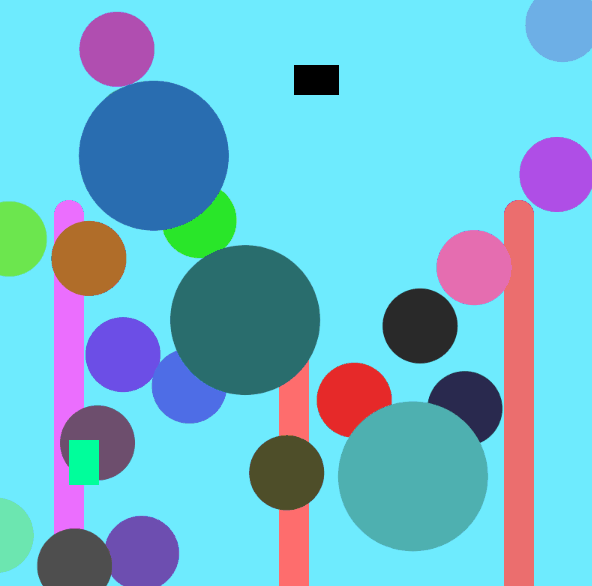
This was SO MUCH FUN!! I’ve never used processing to display visuals on a computer screen, so all the shape stuff was very new and exciting to work with. I originally wanted to do some sort of animation with the 1 and 20, and to have arms and legs for the diceboy, but ran into a lot of issues that were just out of my depth at this point. Definitely went about a lot of this backwards; I feel like the whole code could’ve been 70% shorter. Major speedbumps I had:

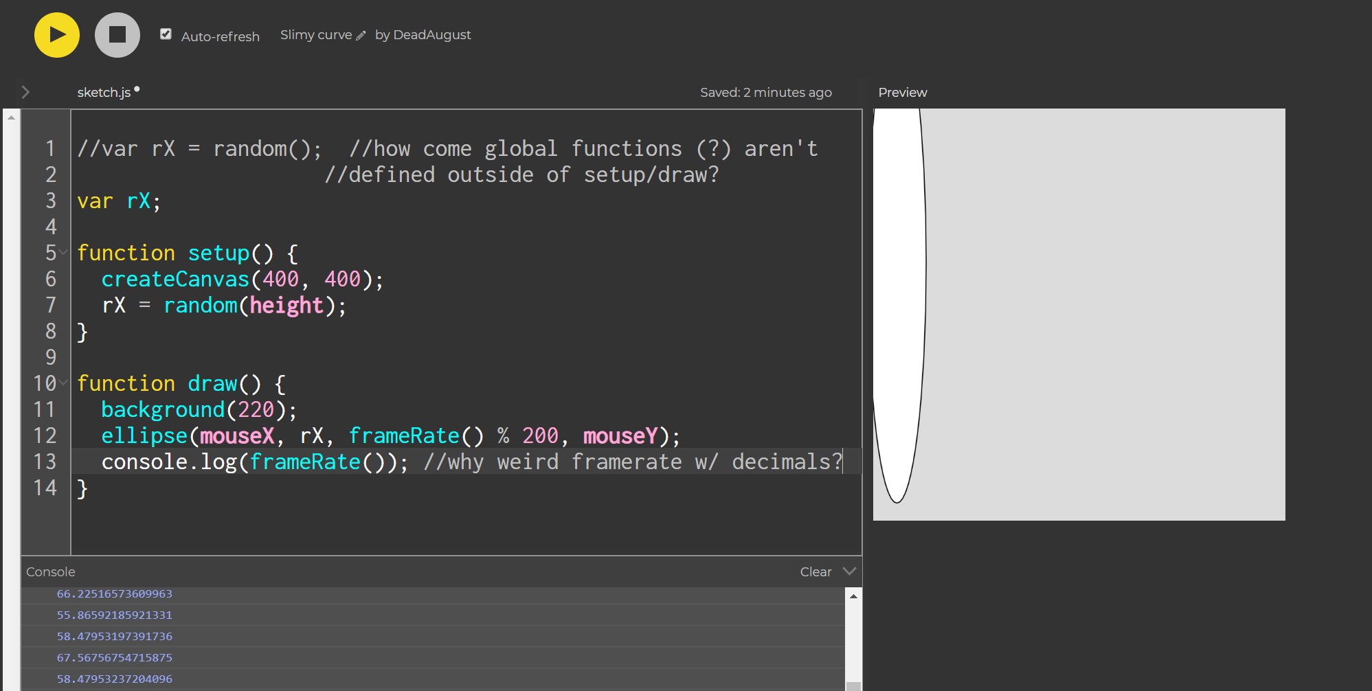
— how to draw an icosahedron when I don’t know fancy maths? (I ended up just eyeballing a lot of it and basing it from the center of the canvas so it would naturally adjust to variable canvas sizes)

—is there a way to have a variable canvas size based on the user’s screen?
— how to draw arms and legs? I couldn’t seem to figure out how to draw an ellipse() at an angle, tried messing with the 5th variable value, but nothing seemed to work.

— how to simplify the loop? I tried defining a couple arrays to hold the d20 values and their corresponding colors, but I’m not terribly familiar with processing or javascript, so couldn’t figure out why something like this wouldn’t work:

var d20color = [(255, 0, 0), (255. 255, 0), (0, 0, 255)];

background(d20color[2]);

— is there an easier way to define variables by the width and height without having to declare them in each local function? I was hoping to just define them at the top like with var d, but then realized they didn’t have the width or height yet because those would have been declared after, in setup().

— when testing this on mobile, i had to be really quick and deliberate with my presses, or else it would register two presses. I figured some sort of debounce was built-in, but confused now.

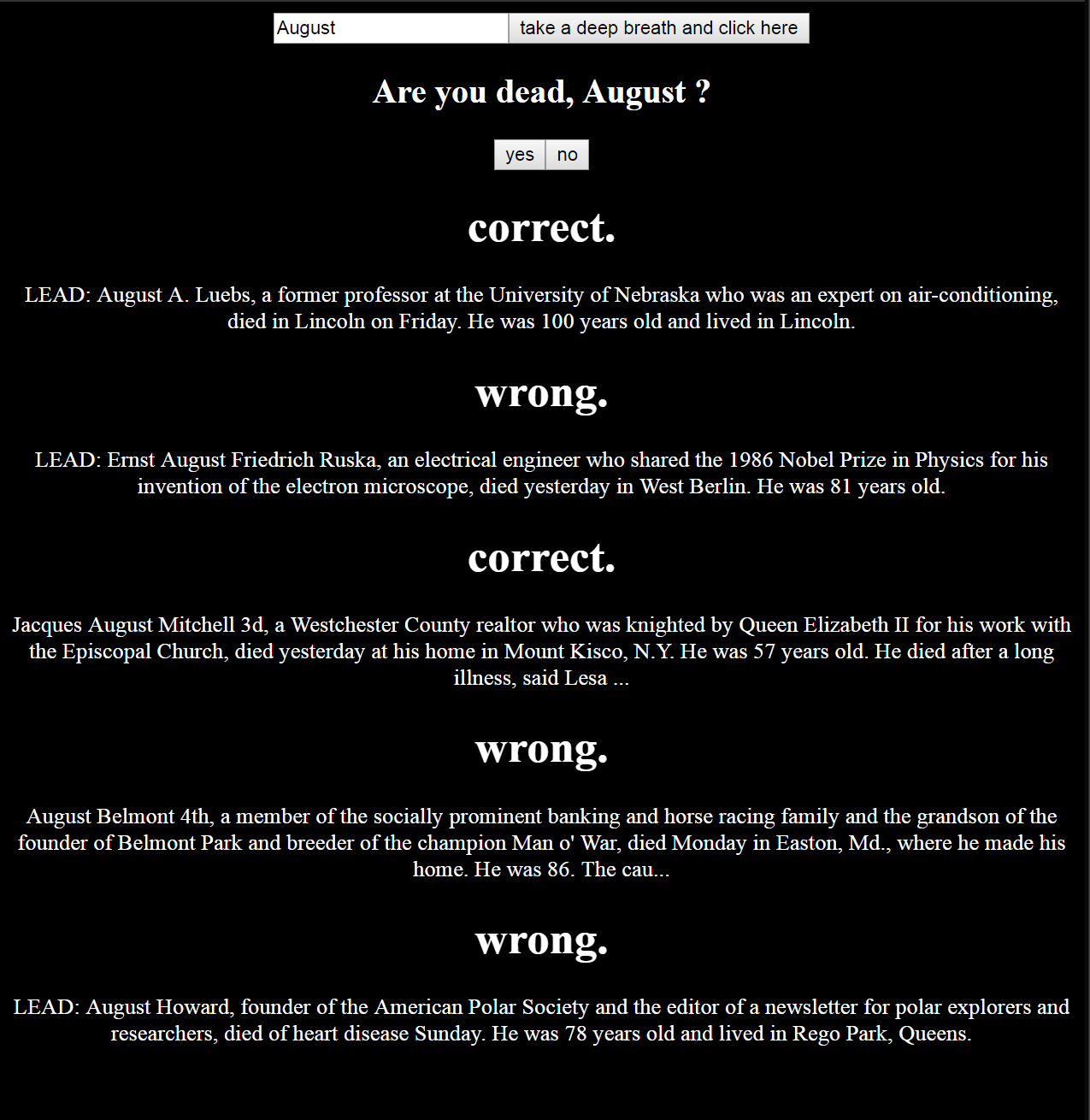
It’s interesting to try and answer the question as to how computation applies to my interests…. I guess it’s hard because that first requires me to narrow down my interests… I think I’ll shoot for low-hanging fruit on this one since it’s past midnight and I still have another class’ worth of homework to do — I’m into games. If it wasn’t obvious by now, I love Dungeons and Dragons — I had my dice on me in class because some Thursday nights I’m a dungeon master for hire. So when searching for inspiration for this assignment, I took the Math.random d20 example from class and ran with it. Learning more programming excites me because I’ll be able to rapidly expand my toolset for building interactive experiences, including developing code for some live games that I want to have digital elements. Overall, excited to have this proof of concept, and eager to look back on my clunky code in a few months with leagues more wisdom (+4 WIS?). Too bad it’s too clunky to be worth actually implementing at the table, but fun nonetheless.

May you always roll 20’s,
August


code at the p5.js web editor and github:

https://editor.p5js.org/DeadAugust/sketches/SyJVKR8dm

https://github.com/DeadAugust/ITP-ICM/blob/master/d20boy

tags: ICM
Wednesday 09.12.18
Posted by August Luhrs
 

Video + Sound Week 1: Sound Walk

For sound walk research, I decided to check out the “Passing Strangers” experience in the East Village. Since poetry was my emphasis in undergrad, I thought it would be nice to take a physical tour of a field I had mainly only engaged with on the page, and it really did turn out to be a really exciting way to delve deeper into the history of these poets. Well, exciting might be an exaggeration; If I hadn’t been marching around the neighborhood, I’d have fallen asleep.

First off, I love this medium. I’m all about participation, and I think sound walks are a great way to engage audiences in novel ways. There are a lot of aspects of the form that have their drawbacks though, especially sound walks that have people going to very specific physical locations — how do you design an experience around objects that may not be there in the future of the listener? I dragged my partner along for the sound walk, and the first location we arrived at was the gorgeous old church that was supposed to be the setting for the first 10-15 minutes of the piece. It was really nice to look at, but closed, so we couldn’t engage with any of the very site-specific audio tour until we changed locations. Not a great start. Seems like these pieces have a significant risk of getting out-of-date really quickly. Halfway through the sound walk, I wondered if this was a sound walk about the history of poetry in the East Village or about gentrification. A handful of locations clearly had been replaced very recently, like the important-sounding church across from Ginsberg’s apartment that was now a condominium complex (only 1.45 million per unit!).

Throughout the piece, I kept thinking about the subtle background activities of participants in sound walks, mainly about how great a way it was to trick people into exercising. The pacing was set very expertly (really, how do they account for groups with various walking speeds?), but I couldn’t help notice how much walking we had to do over the hour and half. My stomach noticed also, and there were a few times I got distracted as the voice directed me to walk past very delicious-seeming local restaurants. I had a hard enough time focusing on the myriad of faceless poets and their voices, but you tell me to walk past a steaming tower of lamb or a plate overflowing with loaded french fries? Sorry beats, but the real Howl is coming from my gut. Great way to tour local businesses though, going down all those random streets.

I figured with my poetry background I would have found the whole thing illuminating and inspiring, but it felt more like I had been tricked into taking a history class. I can’t imagine what someone who cared nothing about poetry would’ve thought. I definitely want to try another sound walk in the future, but hopefully one with a bit more artful experimentation and less droning on about a muddled slew of faceless men.

— HW Update —

Our sound walk group meeting went amazing, had a great time brainstorming our piece and beginning to collect sounds. Here is the link to our group’s material thus far:

https://drive.google.com/drive/folders/1HtgBdYrjOe-Sz6uwbTCsY0tVsEtPOEz4?usp=sharing

tags: Video+Sound
Tuesday 09.11.18
Posted by August Luhrs
 
Newer / Older

Powered by Squarespace.